

Principles of designing
Media designers - those
who create newspapers, magazines, web pages, advertising, and any other visual
media image - operate with a basic set of principles, just as artists,
musicians and writers do. Certain visuals are more appealing to you when you
view them. Usually, this is not an accident; it is the result of careful
planning based on design principles. Here are some design principles that need
to be addressed when taking photographs or video or constructing web pages or
newspaper layout.
These are the important points need to be consider at the time of advertising designing.
- Balance
- Proportion
- Repetition and Variety
- Sequence
- Unity
- Emphasis and Economy
Balance
|
Most of us prefer that our lives have balance. Most of
us do not like living "on the edge." We want order to our lives.
The same is true in design. Balance is the first principle of design. Balance
has to do with the way you distribute the weight on each side of an image or
layout. You give as much "weight" to the left side as to the right
side, the top and the bottom. This is called symmetry.
|
There are numerous ways to achieve symmetry. A
symmetrical page in a publication would have the left side and the right side
of the page balanced. Doing this occasionally is fine, but having everything
balanced in a media design all the time is boring. Yes, we like balance in
our loves, but we don't like looking at symmetrical things often. That's why
movies rarely work when they deal purely with "ordinary," everyday
life.
 |
Look at the photograph above. It has mirror image
symmetry, but it is not particularly compelling.
|
Proportion
|
This is something that should work naturally. It is simply arranging
spaces in the picture in pleasing relationship. The bigger something is, the
more space it should receive. Book pages are proportional, i.e. they have
good shape in height versus width. You don't have to have identical size
margins on all side in all types of publications. The same would be true of
web pages. Something may be heavier on the left than on the right.
 |
Another way to think proportionally is to assume that things that are
more important are made larger. Therefore, the more important items are
larger than the less important items. Look, again, at the Palm Beach
Post front page. What is the most important item? Is it the largest?
The most important item should be the photo of the confrontation between
Buddhist monks and the police since it's the largest item on the page.
|
Repetition
and Variety
You'll want to keep both of these in mind. Repetition is repeating visual
elements to create a pattern. Gestalt psychology tells us that our minds like
patterns (and often look for them even when they may not be there). it is
pleasing to the eye to find these patterns in the things that you want to
photograph and to create them in your media designs.
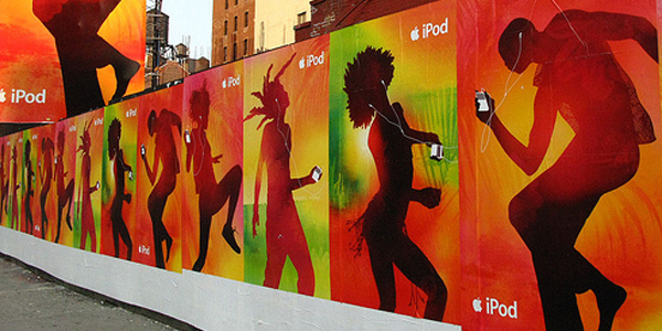  |
Conversely you'll also want to look for variety, which breaks the pattern
of repetition. This helps to keep the viewers's attention. We don't like to
look at the same thing over and over. Variety breaks up the monotony and
gives us a surprise at times. take a look at this photo and think about how
these two are working together.
|
Sequence
|
This is an idea that you'll think about specifically with web or
newspaper design. Simply, you do not leave to chance the order in which a
reader perceives objects on a page or screen. This concept goes naturally
with the idea of balance and proportion.
 |
Example of Newspaper sequence
1. Readers in the Western world generally read from left to right,
top to bottom2. But, readers also move from big to little, black to white, color to non-color, from unusual shapes to ordinary shapes. You can move readers with lines or imagined lines that might do all sorts of things such as extend into another element on the page.
3. This means that you as a designer can move readers' eyes in sequence all over the page if you plan carefully.
Unity
|
This deals with harmony. Everything should and must look as if it fits
together. This applies to photographs in such a way the elements should
cohere. Everything in the photograph should strive to be its own little piece
of art.
 |
Emphasis and Economy
|
These two should be considered together. With emphasis you want to train
yourself to look through the viewfinder and focus on a single visual element.
Decide what the focal point of the event is and then position the camera
accordingly. With economy you'll want to eliminate everything not necessary
to communicate the information. Frame the shot so that all the other things
that distract from the focal point are out of the photo.

for more information kindly visit youtube video
|


First time I visited this blog. Really this is awesome blog. It is very pleasure to get it as I got huge helps right here. best web designing company in warangal
ReplyDeletebest web designers in warangal
best web designing companies in india